Data Plotting User Manual
The Data Plotting module enables visual exploration of your dataset using:
- Histograms
- 2D scatter plots
- 3D scatter plots
These visual tools help identify data distributions, trends, and potential anomalies.
Histogram Plotting
A Histogram displays the distribution of a single variable by grouping values into bins, making it easy to understand frequency and spread.
When to use histograms
Use histograms to:
- Inspect the distribution of a variable
- Identify skewness or multimodal behavior
- Detect outliers
- Compare frequency vs. density representations
Step 1: Access the Data Plot Module
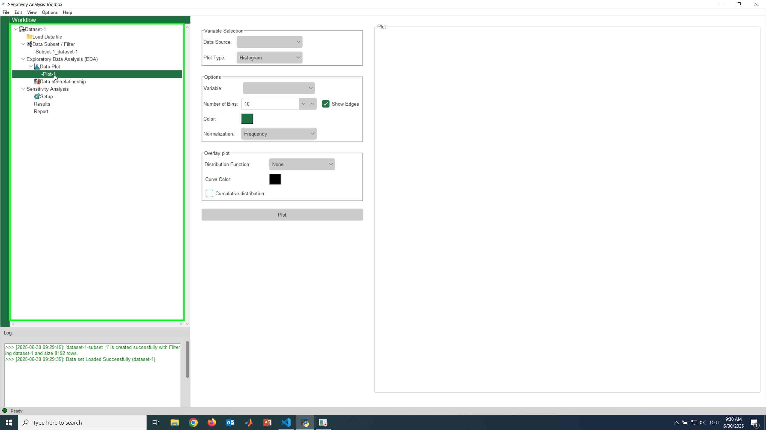
Navigate to the Exploratory Data Analysis (EDA) section in the workflow panel.
Expand the section and select Data Plot.
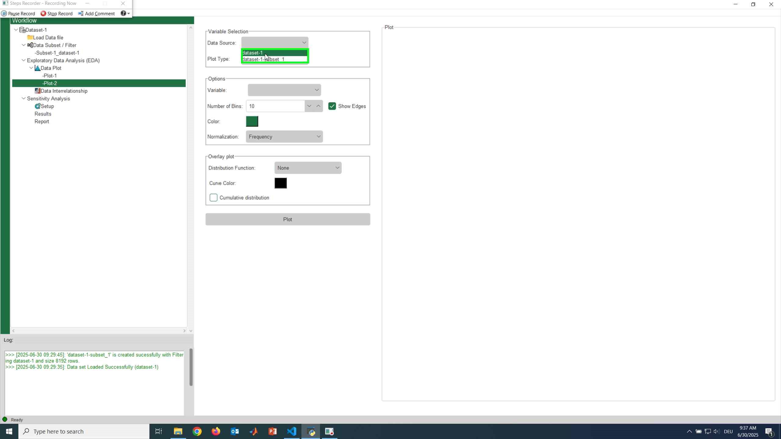
Step 2: Choose the Data Source
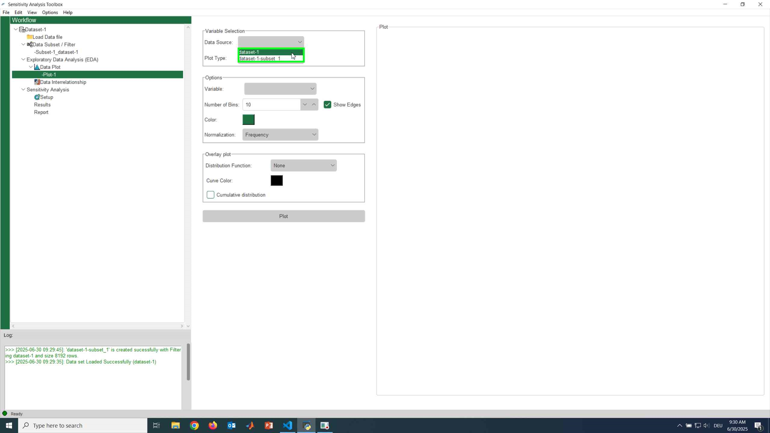
Select the Data Source from the dropdown menu.
This can be:
- The original dataset
- Any previously created subset
Step 3: Select the Plot Type
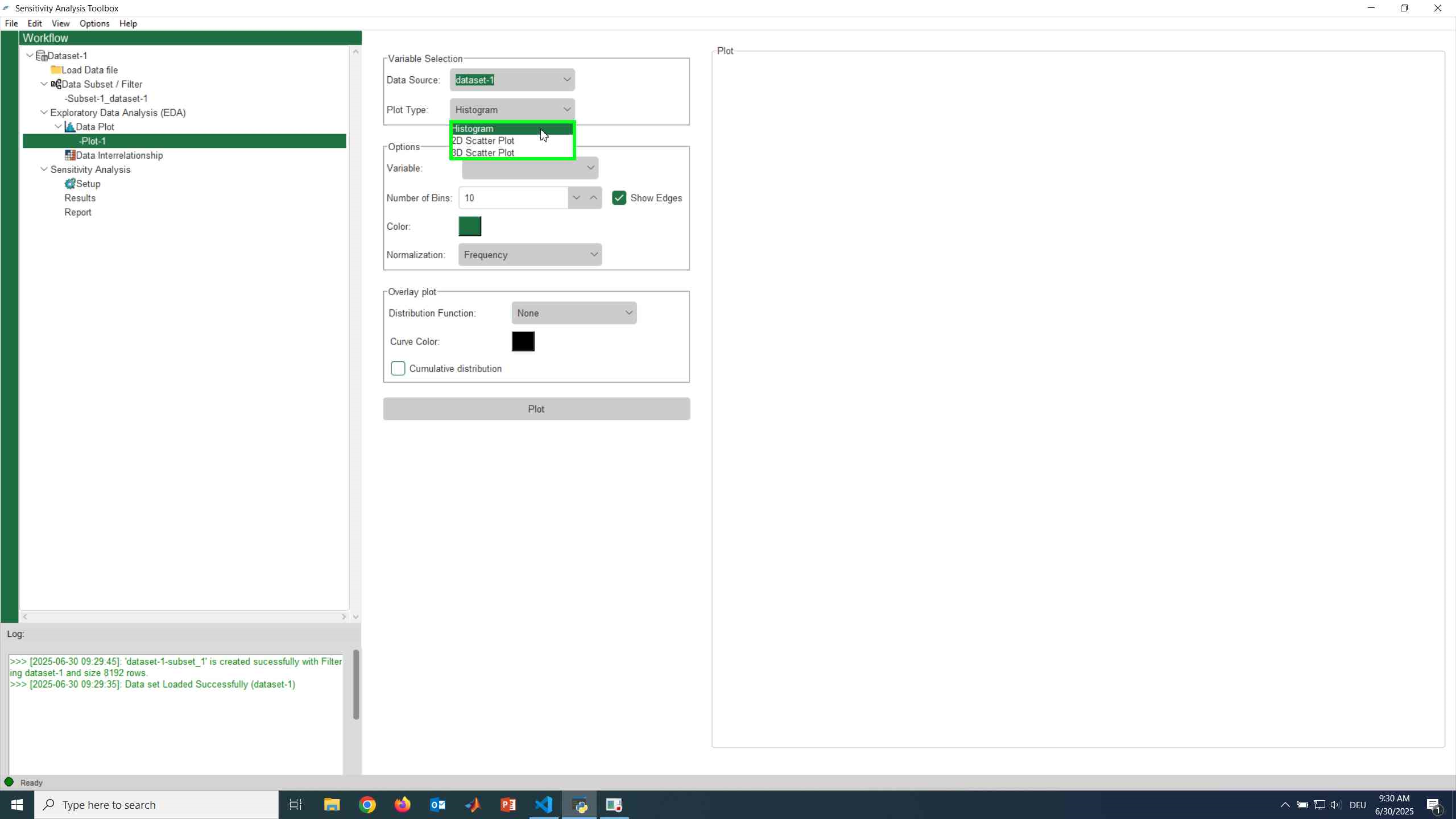
From the Plot Type dropdown menu, choose Histogram.
The interface will automatically update to display histogram-specific options.
Step 4: Select the Variable
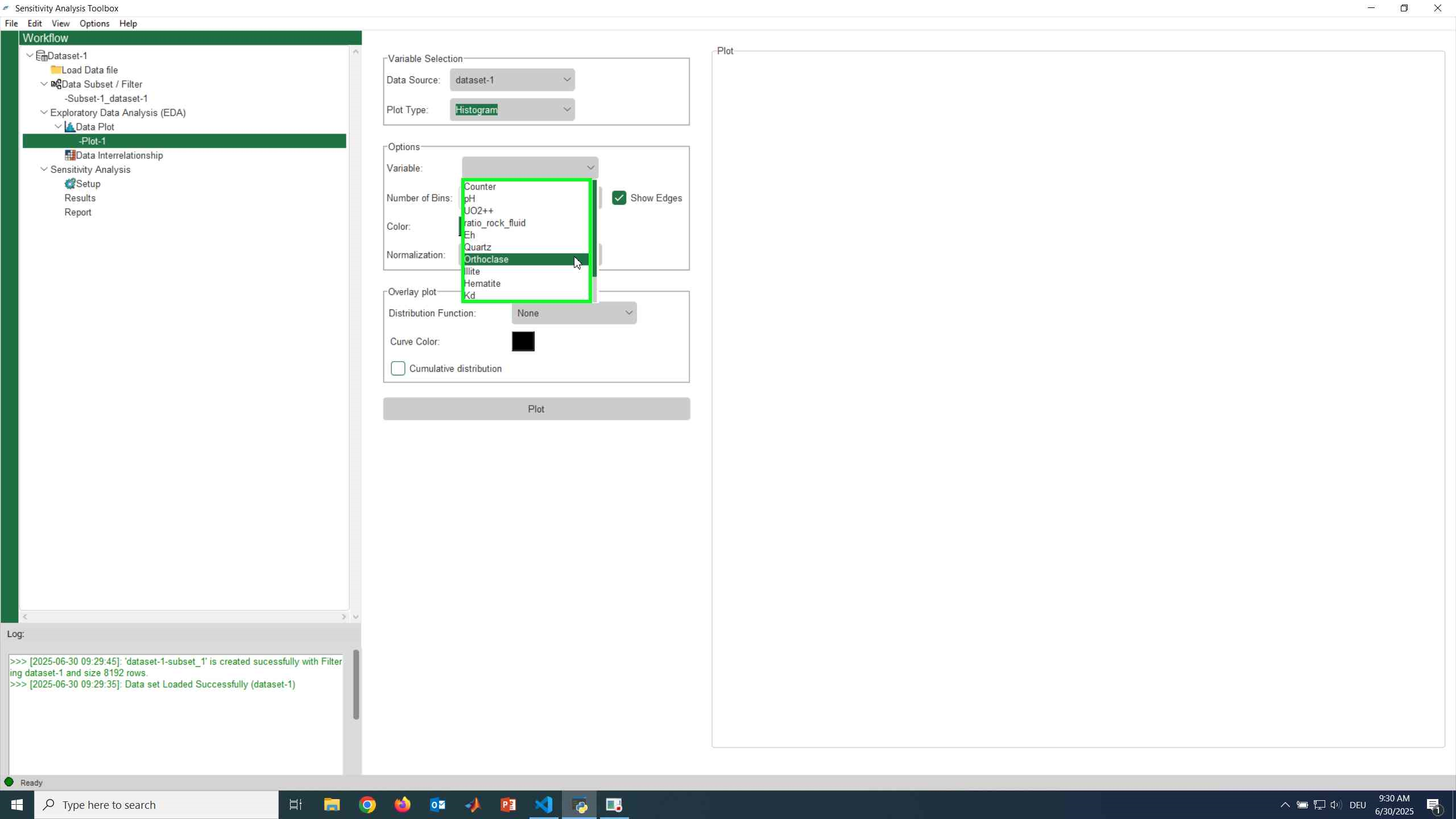
Under the Options panel, select the variable you want to analyze from the dropdown list.
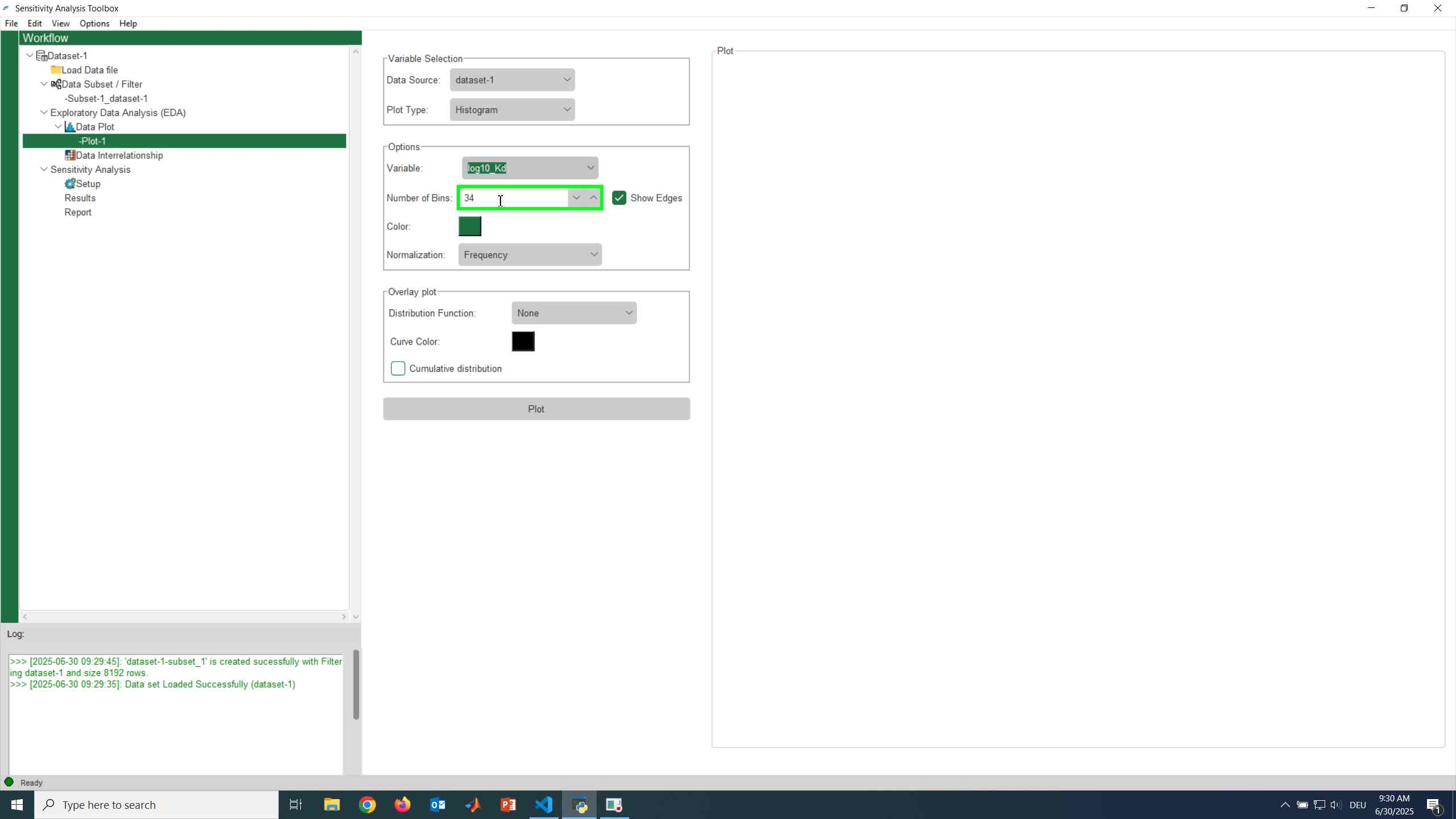
Step 5: Configure Histogram Options
Adjust the histogram settings to suit your analysis needs:
-
Number of Bins
The initial number of bins is automatically estimated using the
Freedman–Diaconis rule, which accounts for the data’s interquartile range (IQR).
You may manually adjust this value if desired. -
Color
Choose the bar color from the color palette. -
Normalization
Select how the data should be normalized:- Frequency — counts per bin
- Density — probability density
-
Show Edges
Enable this option to display bin boundaries.

Note
Changing the number of bins or normalization can significantly affect how the data distribution appears.
Step 6: Plot the Histogram
Click the Plot button to generate the histogram. The plot will be displayed in the visualization panel.
Step 7: Overlay a Distribution Curve (Optional)
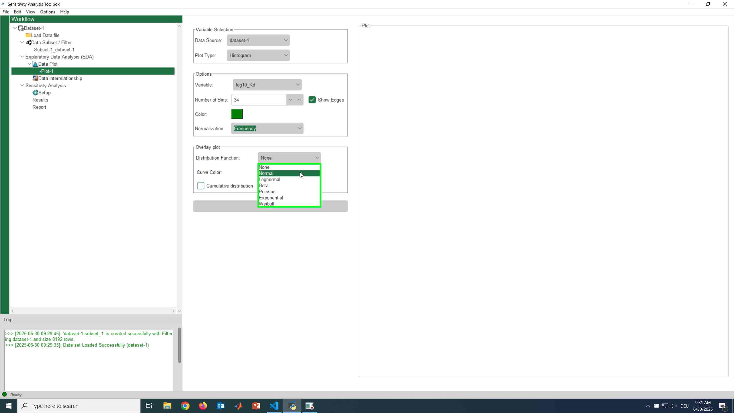
You can enhance the histogram by overlaying a theoretical or fitted distribution:
- Select a Distribution Function from the dropdown menu
- Choose a Curve Color
- (Optional) Enable Cumulative Distribution to display the cumulative curve

Overlay distributions
Overlay curves are useful for:
- Comparing empirical data to theoretical distributions
- Understanding cumulative probability behavior
2D Scatter Plot
A 2D Scatter Plot visualizes the relationship between two variables by plotting data points along the x- and y-axes. It is especially useful for identifying correlations, trends, clusters, and nonlinear behavior.
When to use a 2D scatter plot
Use 2D scatter plots to:
- Explore relationships between two variables
- Detect correlations or patterns
- Identify outliers and clusters
- Visually assess regression fits
Step 1: Select the Plot Type
In the Plot Type dropdown menu, select 2D Scatter Plot.
The interface will update to display scatter-plot–specific options.

Step 2: Configure Axis Options
In the Options panel, configure the axes:
- X Variable — Select the variable for the x-axis
- Y Variable — Select the variable for the y-axis
- Log Scale — Enable logarithmic scaling for either or both axes if required
Note
Log scaling is useful when working with variables that span multiple orders of magnitude.
Step 3: Configure Marker Options
Click Marker Options to customize the appearance of the scatter points.
A popup window will open with detailed styling options.

Marker Customization
Within the Marker Options window, you can adjust:
- Marker Shape
- Marker Size
- Opacity (Face Alpha)
- Face Color

Variable-Based Coloring (Optional)
You can color the markers based on a third variable:
- Select Variable Color
- Choose the variable from the dropdown menu
- Select a color map
- Click Save Options to apply the changes


Info
Variable-based coloring adds an additional data dimension to the 2D scatter plot.
Step 4: Plot the 2D Scatter Plot
After configuring the options, click the Plot button.
The scatter plot will be rendered in the plotting area. 
Step 5: Optional Regression Plot
To overlay a regression curve:
- Enable Regression
- Set the Polynomial Degree
- Degree
1→ Linear regression - Higher degrees → Polynomial regression

After plotting: - The fitted curve appears over the scatter points - The regression coefficients and the coefficient of determination
\( R^2 \) are reported in the Log panel

Warning
Higher-degree polynomial regression may overfit the data.
Always interpret regression results in the context of your problem.
3D Scatter Plot
3D Scatter Plot
{: .toc}
A 3D Scatter Plot visualizes the relationship between three variables by plotting data points in three-dimensional space. This plot is useful for exploring multivariate relationships and identifying clusters or trends involving three parameters.
When to use a 3D scatter plot
Use 3D scatter plots to:
- Explore interactions between three variables
- Identify multivariate trends or clusters
- Add a third dimension to 2D relationship analysis
Step 1: Select Data Source and Plot Type
Select your Data Source from the list.
Then, in the Plot Type dropdown menu, choose 3D Scatter Plot.

Step 2: Assign Variables
In the Options panel, assign variables to the axes:
- X Variable — Select the variable for the x-axis
- Y Variable — Select the variable for the y-axis
- Z Variable — Select the variable for the z-axis

Step 3: Configure Marker Options
Click Marker Options to customize the appearance of the scatter points.
The available options are the same as those used in the 2D Scatter Plot, ensuring visual consistency across plots.

Within the Marker Options window, you can adjust:
- Marker Shape
- Marker Size
- Opacity
- Face Color
Info
Marker face color can be set either as a constant value or mapped to a variable using a colormap, following the same approach as in the 2D scatter plot.
Step 4: Plot the 3D Scatter Plot
After configuring all settings, click the Plot button.
The 3D scatter plot will be rendered in the designated plotting area.

Note
You can rotate and inspect the 3D plot interactively to better understand spatial relationships between variables.
Editing, Saving and Extracting Figures
After generating the plot, in the navigation toolbar below the figure, you can find the save icon. 
In the Save as type dropdown menu, you have several options to choose from. Here are some available formats:
- Portable Network Graphics (PNG)
- Encapsulated Postscript (EPS)
- Joint Photographic Experts Group (JPEG)
- Portable Document Format (PDF)
- PGF code for LaTeX
- Postscript
- Raw RGBA bitmap
- Scalable Vector Graphics (SVG)
- Tagged Image File Format (TIFF)
- WebP Image Format
In addition to saving options, the navigation toolbar also provides functionalities to adjust the appearance of the figure. You can modify: - Axis labels and titles, as well as Font size. - Grid lines and background colors to improve the visual presentation. - Zoom in and out of the figure.